We're thrilled to introduce a new chart type for your dashboards - Tables!
👀 What’s New?
-
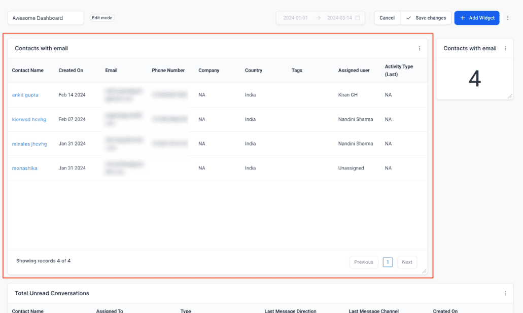
Table Charts: Now, all your widgets can be transformed into detailed list views, offering comprehensive insights at a glance.
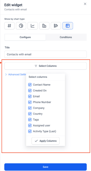
- Customisable Columns: Manage the columns you want to see on the widget. Tailor your view to focus on the metrics that matter most to you and your business.
-
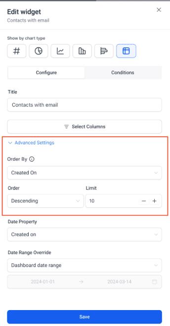
Sortable Lists: Take control of your data with the ability to choose the column by which you want to order the table list. Easily organize and analyze your information for enhanced clarity and efficiency.
-
Interactive Functionality: Tables are not just static displays - they're interactive! Users can click on contact names directly within the table widget to quickly redirect to the contact page for seamless, efficient actions.
👷 How It Works:
- Go to your dashboard.
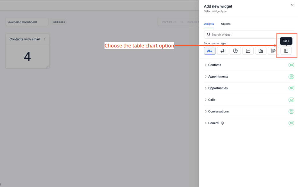
- Click on the edit icon and then Add widget.
- Scroll down to the widget you want to add.
- Change the chart type to table.
- Click on Select Columns to manage columns you want on your widget (Optional)
- In advance settings, you can choose the column on which you want to order the table (Optional)
- Click on Save.
🌟 Why it Matters:
Table charts provide a structured and organised format for presenting complex data, making it easier to extract valuable insights and trends. By offering customisable columns and sortable lists, the interactive table widgets empower users to efficiently navigate and analyse their data, enabling informed decision-making and driving business growth. With this feature, users can unlock the full potential of their dashboards, transforming raw data into actionable intelligence with unparalleled ease and precision!
Imp Note: Table chart supports upto 10,000 records per widget.